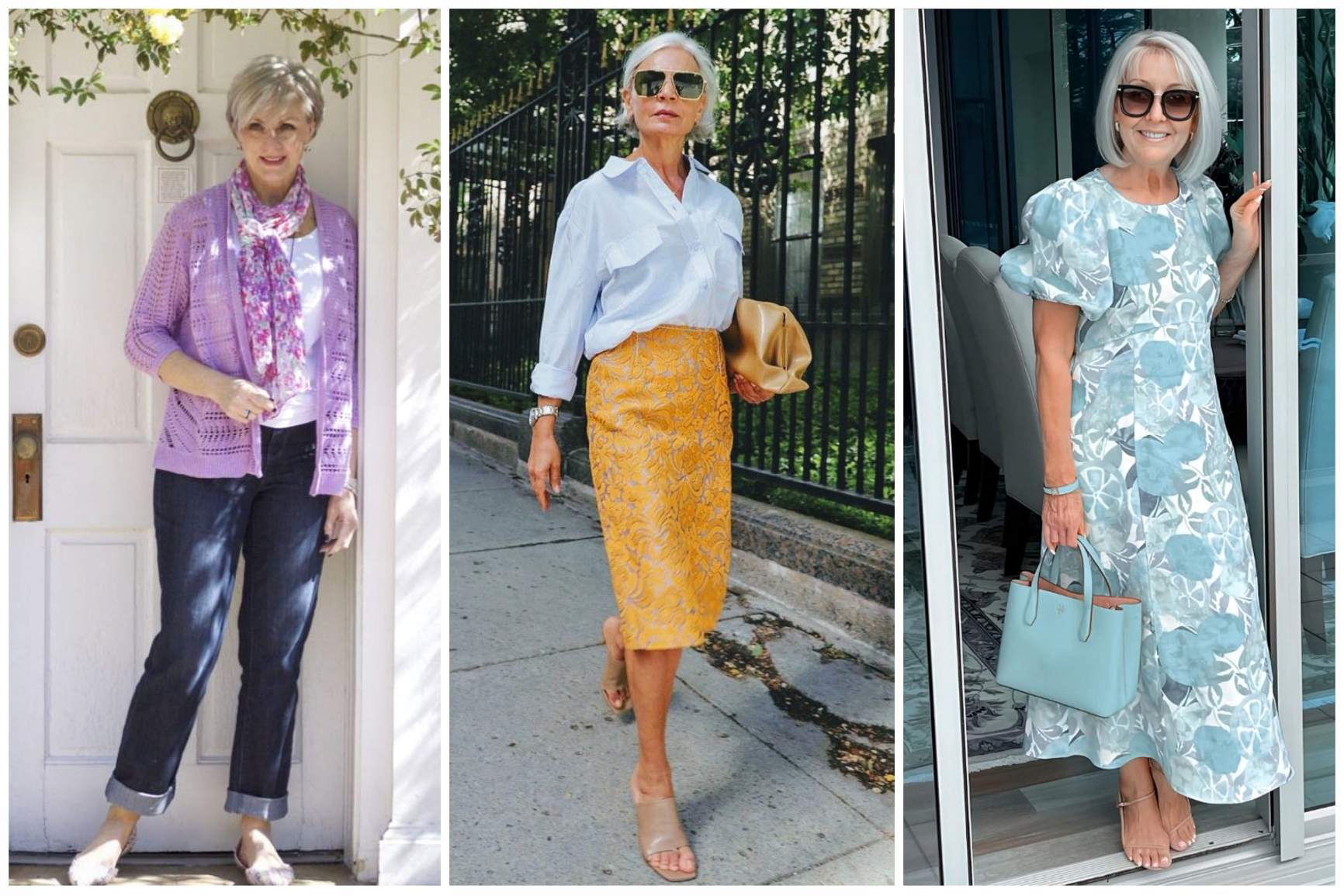
As we age, skin often loses some of its natural contrast and brightness. A harsh color top near the face can make fine lines, dark circles, and shadows appear more noticeable. Some colors can also look a little heavy and severe, especially during the daytime.
Today’s post is all about the best color for women over 50. These colors elevate your whole look and keep it polished and chic.
We dive deep and cover everything –
- Why the color suits mature skin
- How to style it
- Colors to pair it with
- Best suited for what hair color and undertone
I have included a color that you should avoid towards the end of the post. Why there? You will know when you reach there! (Feels like finding Easter egg)
Best Colors for Women Over 60
Trending
15 Fashion Mistakes Making You Look Older
How to Dress in Your 60’s to Look Chic?
1. Soft White and Cream
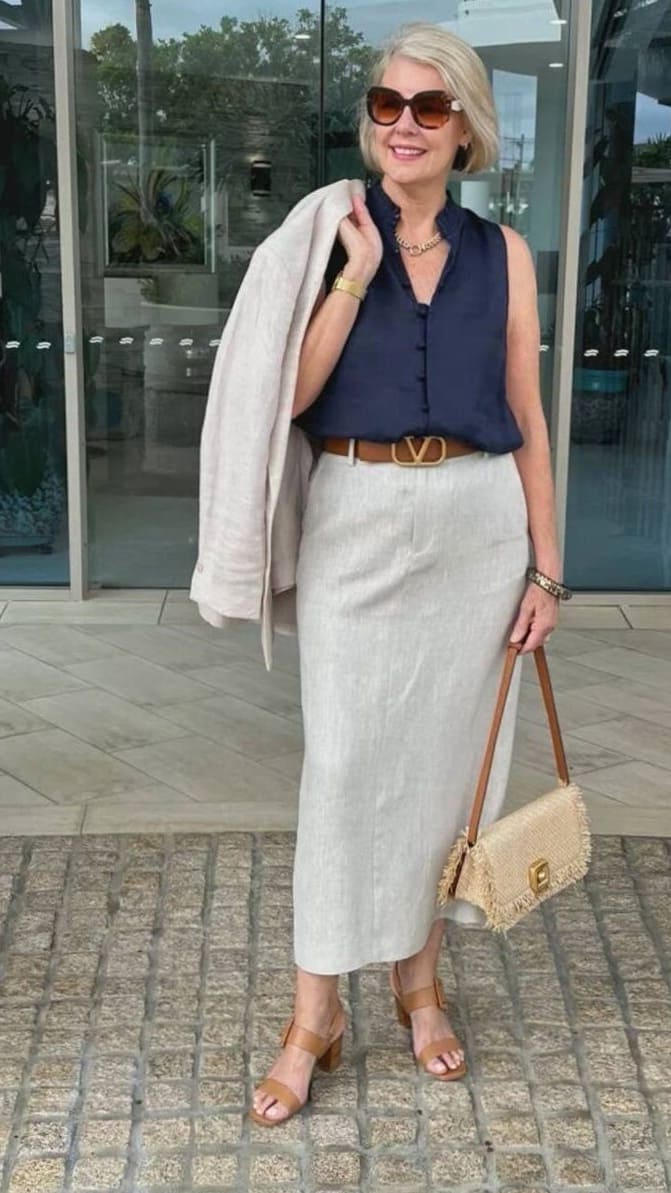
Soft white, okay? Not talking about stark white here.
Secondly, it is 2 different colors – Soft White and Cream. I am not talking about it as a combo. It is 2 separate colors stacked together because they sit close in shade variation.
Why It Works After 60
Soft white and cream shades can look incredibly fresh and elegant after 60 because they brighten the face without the harshness of stark optic white.
I find these softer tones much more forgiving on mature skin, especially in natural daylight.
They also give outfits a relaxed luxury feel that always looks polished.
Best Pairings
- Cream + Soft Camel
- Soft White + Navy
- Cream + Dusty Rose
- Soft White + Light Gray

Best For
Soft white and cream, both look especially flattering on women with gray or blonde hair because the tones feel soft and harmonious together.
I also think these shades work beautifully on warm and neutral undertones since they add warmth without looking overpowering.
What To Avoid
I would avoid pairing soft cream shades with overly bright optic white because the contrast can make cream look dull or yellow.
Very stiff fabrics can also make these softer colors lose their elegant effect.
Most Elegant Way To Wear It
Best ways to wear soft white or cream is in tonal outfits. Pair it with layered textures like linen, knitwear, or soft tailoring.
I also love these shades with gold jewelry because the combination feels timeless and refined.
2. Soft Navy
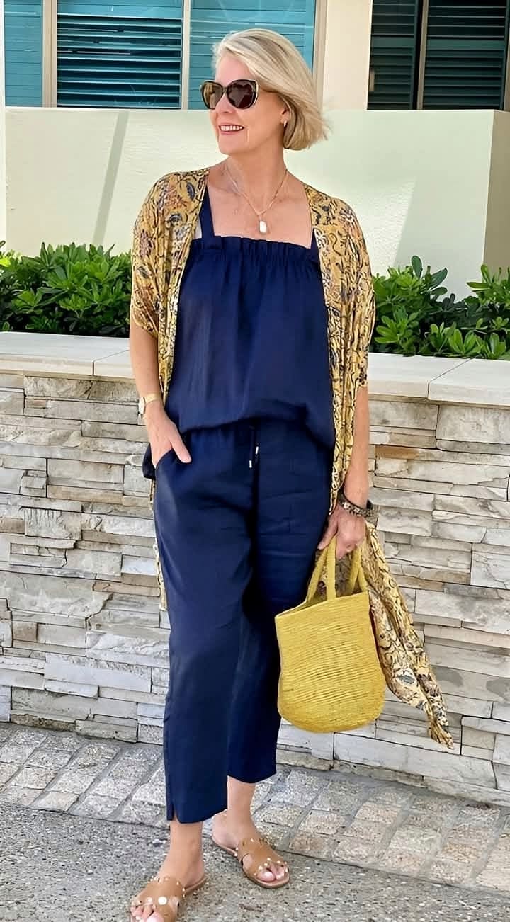
Soft navy feels elegant without looking too harsh on mature skin. I love it because it gives the polish of black but with a much softer and more flattering effect.
Why It Works After 60
It also works beautifully for everyday outfits while still looking refined and expensive.
If bright colors feel overwhelming or dark feels too heavy now, soft navy is one of the easiest upgrades you can make.
Best Pairings
You can pair it with many colors. Here are a few suggestions.
- Soft Navy and Ivory
- Soft Navy and Dusty Pink
- Soft Navy and Silver Gray
- Soft Navy and Soft Camel
Best For
Soft navy looks especially beautiful on women with gray or brunette hair because it creates softness around the face without looking dull.
I also find that this color works best on cool and neutral undertones since it naturally complements the skin instead of overpowering it.
What To Avoid
I would avoid wearing soft navy with very harsh black pieces because the contrast can make the outfit feel heavier than intended.
It is also better to skip overly shiny fabrics since they can take away from the relaxed elegance of the color.
How To Wear It
One of the most elegant ways to wear soft navy is in a monochromatic outfit with different textures like knits, suede, or soft tailoring.
I also love it paired with ivory accessories because the combination looks timeless, polished, and quietly luxurious.
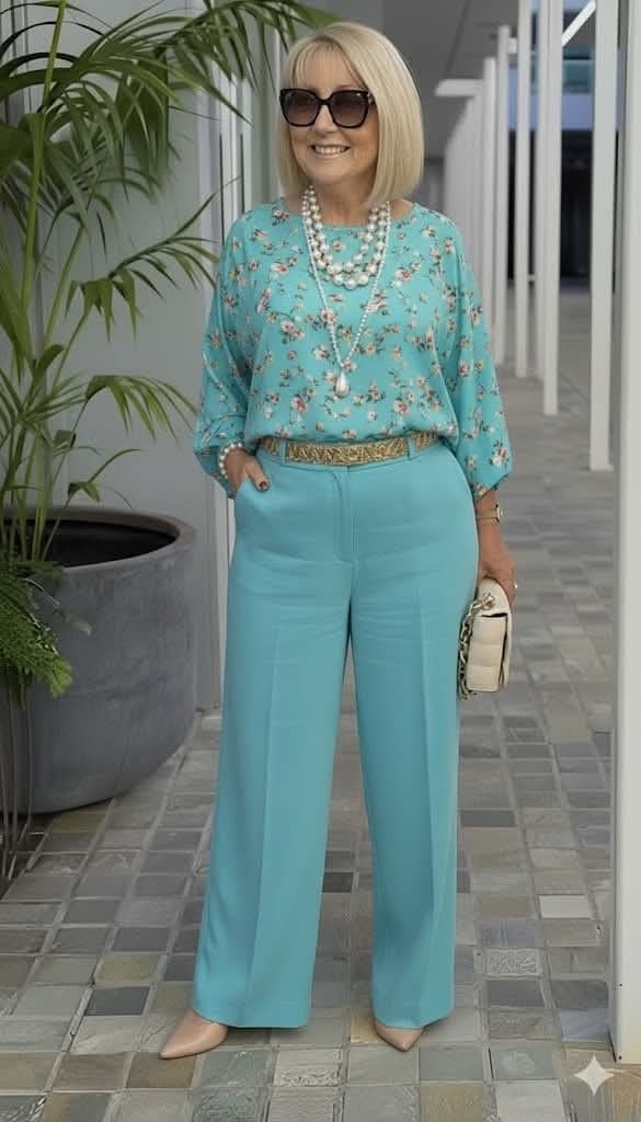
3. Teal
Why It Works After 60
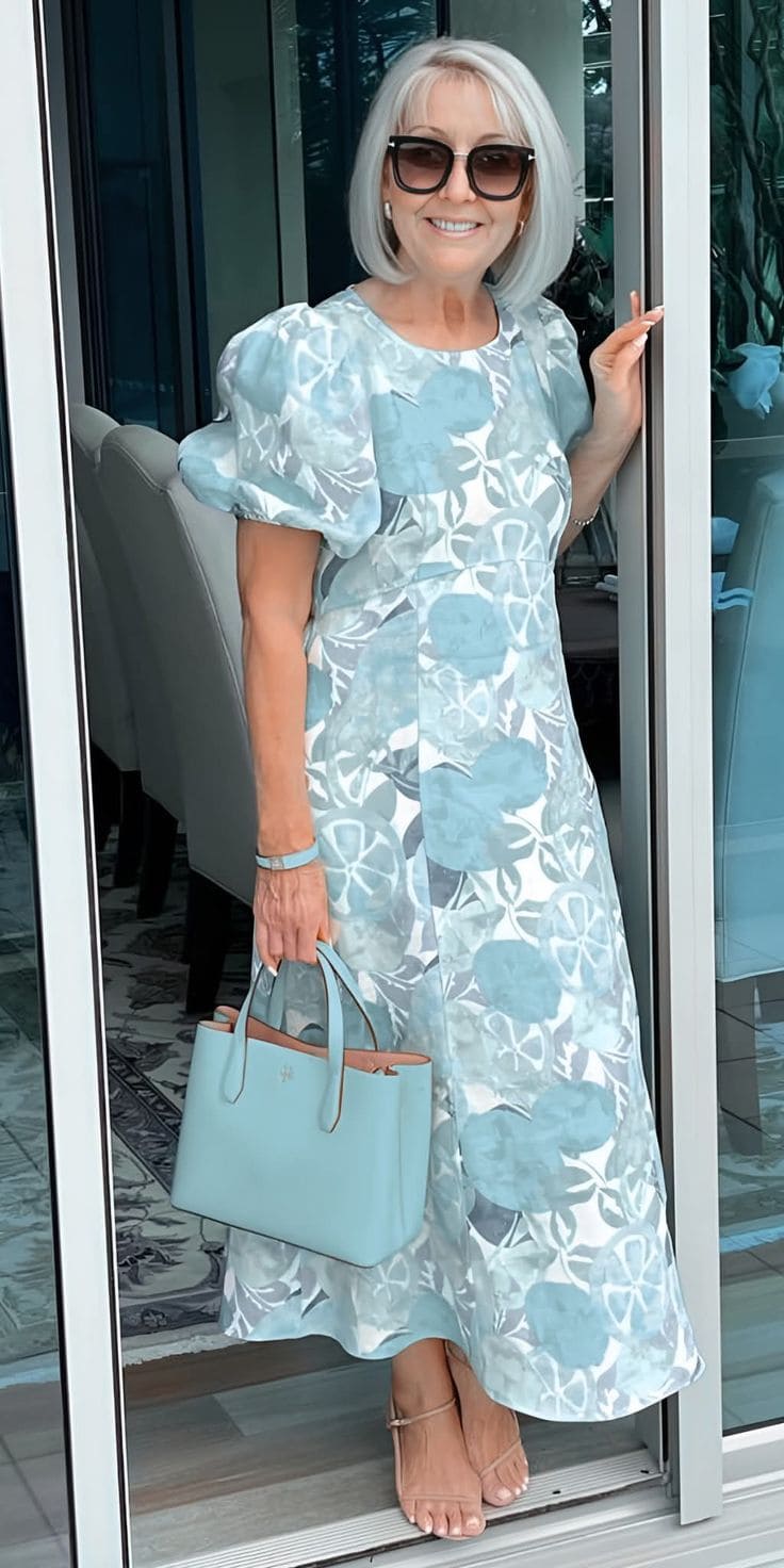
Teal is one of those colors that adds richness and personality without feeling too bright or overwhelming. I love how it brings life to the face while still looking elegant and sophisticated.
It can also make simple outfits feel more interesting without needing a lot of accessories.
Best pairings
- Teal + Cream
- Teal + Soft Gray
- Teal + Navy
- Teal + Camel
Best For
Teal looks especially beautiful on women with silver or brunette hair because the contrast feels vibrant yet balanced. It flatters cool and neutral undertones particularly well.
What To Avoid
I would avoid pairing teal with overly neon shades because the outfit can quickly start to feel too loud.
Very shiny satin fabrics can also make teal appear harsher than intended.
How To Wear It
You can wear teal as a statement blouse or knit paired with neutral trousers or tailoring. Teal accessories go well with cream outfits because they add color in a sophisticated way.
4. Burgundy

Why It Works After 60
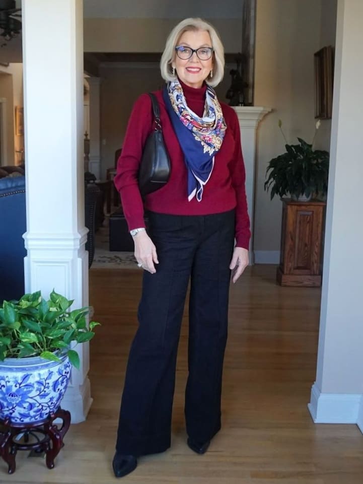
Burgundy has a rich and sophisticated feel that looks especially flattering after 60.
I love how it adds warmth and depth without being as harsh as bright red. It also feels timeless, elegant, and polished, which makes it easy to wear for both casual and dressier outfits.
Best Pairings
- Burgundy with Cream
- Burgundy with Soft Navy
- Burgundy with Charcoal Gray
- Burgundy with Dusty Pink
Best For
Burgundy looks especially beautiful on women with gray or dark brunette hair because the richness of the color creates lovely contrast. It works particularly well on cool and neutral undertones.
What To Avoid
I would avoid pairing burgundy with overly bright red tones because the combination can feel heavy and dated.
Very dark styling from head to toe can also make the outfit lose its softness.
How To Wear It
Style burgundy through soft knitwear, tailored coats, or handbags paired with lighter neutrals. I also love burgundy lipstick or accessories with cream outfits.
5. Sapphire Blue
Why It Works After 60
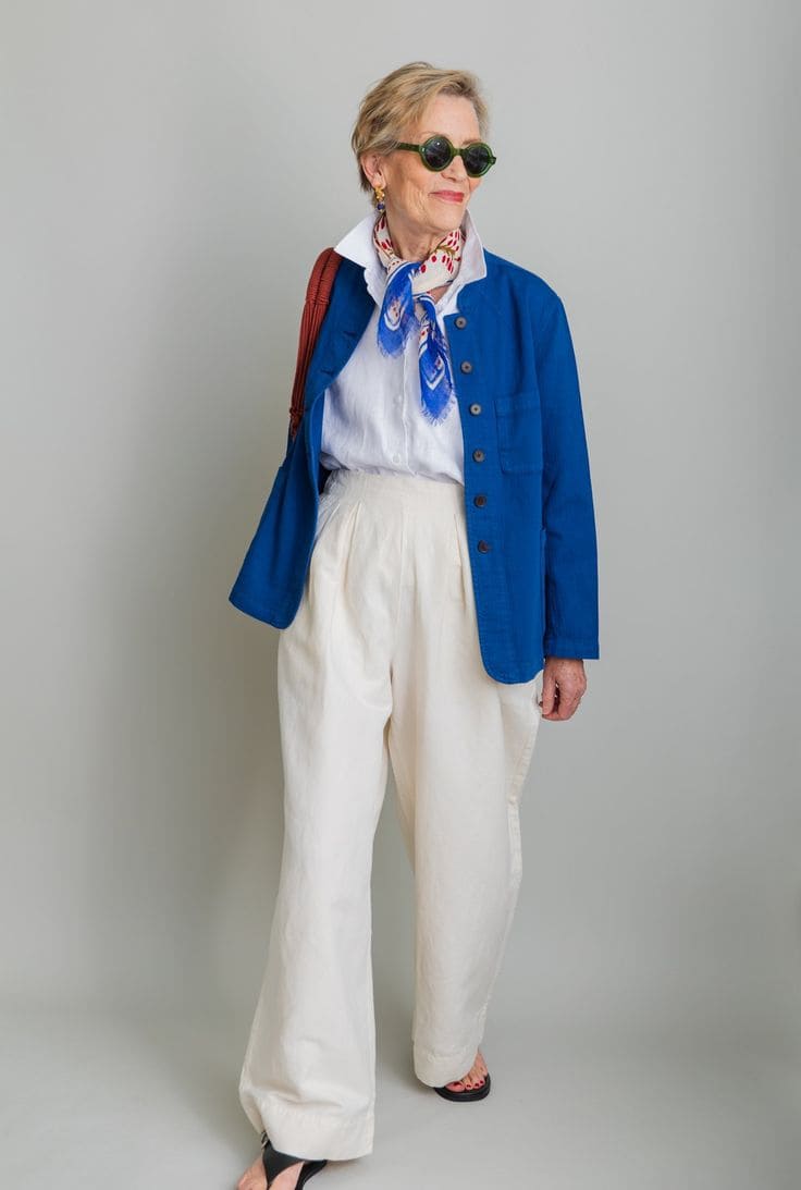
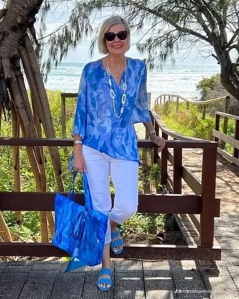
Sapphire blue has a rich, jewel-toned elegance that instantly makes outfits feel more polished. I love how it adds color and vibrancy without looking overpowering or overly trendy.
It also brightens the complexion beautifully and can make even simple wardrobe pieces feel more elevated.
Best Pairings
- Sapphire blue and cream
- Sapphire blue and silver gray
- Sapphire blue and navy
- Sapphire blue and soft white
Best For
Sapphire blue looks especially striking on women with silver or dark brunette hair because the contrast feels elegant and sophisticated.
It flatters cool and neutral undertones particularly well.
What To Avoid
I would avoid pairing sapphire blue with overly neon shades because it can take away from the richness of the color.
Heavy black styling can also make the outfit feel too severe.
How To Wear It
Wear sapphire blue in a flowing blouse, tailored blazer, or statement scarf paired with soft neutrals.
6. Mauve
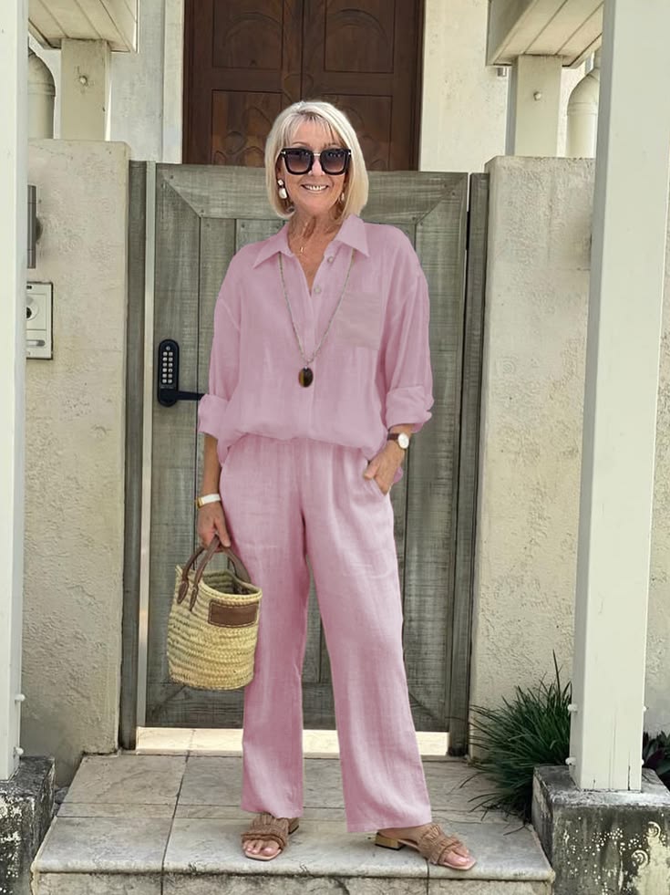
Why It Works After 60
Mauve has a soft, muted elegance that feels feminine without looking overly sweet. I love how it adds gentle color to the wardrobe while still feeling sophisticated and wearable.
It also has a calming softness that can make mature skin appear fresher and more radiant.
Best Pairings
- Mauve and soft gray
- Mauve and cream
- Mauve and taupe
- Mauve and soft navy
Best For
Mauve looks beautiful on women with gray or ash blonde hair because the softness of the shade feels very harmonious. It flatters cool and neutral undertones particularly well.
What To Avoid
I would avoid pairing mauve with overly bright pinks because the contrast can feel dated.
Very shiny fabrics can also make the color lose its soft elegance.
How To Wear It
One of the chicest ways to wear mauve is through soft knitwear or flowing blouses paired with neutral tailoring. I also love mauve accessories with cream outfits because the combination feels understated and graceful.
7. Blush Pink
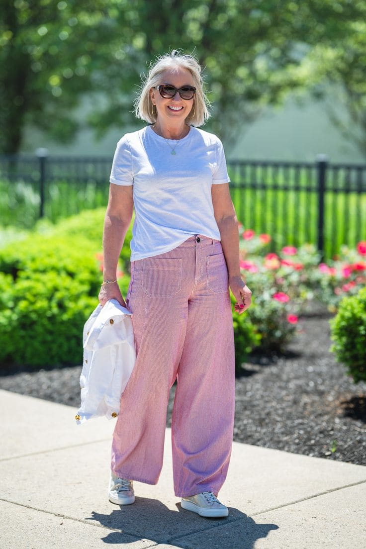
Why It Works After 60
Blush pink can look incredibly soft and flattering after 60 because it brings warmth and brightness to the face without feeling overpowering.
The shade feels feminine, fresh, and elegant at the same time. It also pairs beautifully with neutrals, which makes it very easy to style.
Best Pairings
- Blush pink and cream
- Blush pink and soft gray
- Blush pink and camel
- Blush pink and navy
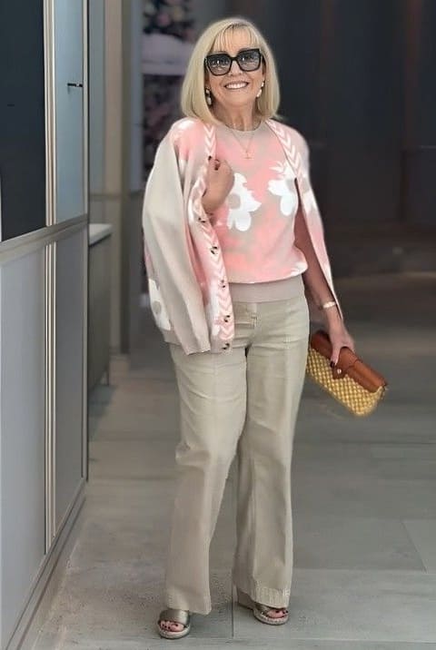
Best For
Blush pink looks lovely on women with silver or blonde hair because the softness creates a beautiful glow around the face. I also find that it works best on warm and neutral undertones.
What To Avoid
I would avoid pairing blush pink with overly sugary pastel shades because the outfit can start to feel too youthful.
Very stiff fabrics can also make the color lose its softness.
How To Wear It
One of the most elegant ways to wear blush pink is in soft fabrics like cashmere, silk, or lightweight knits paired with tailored neutrals.
I love blush pink coats or scarves because they add color in a very refined way.
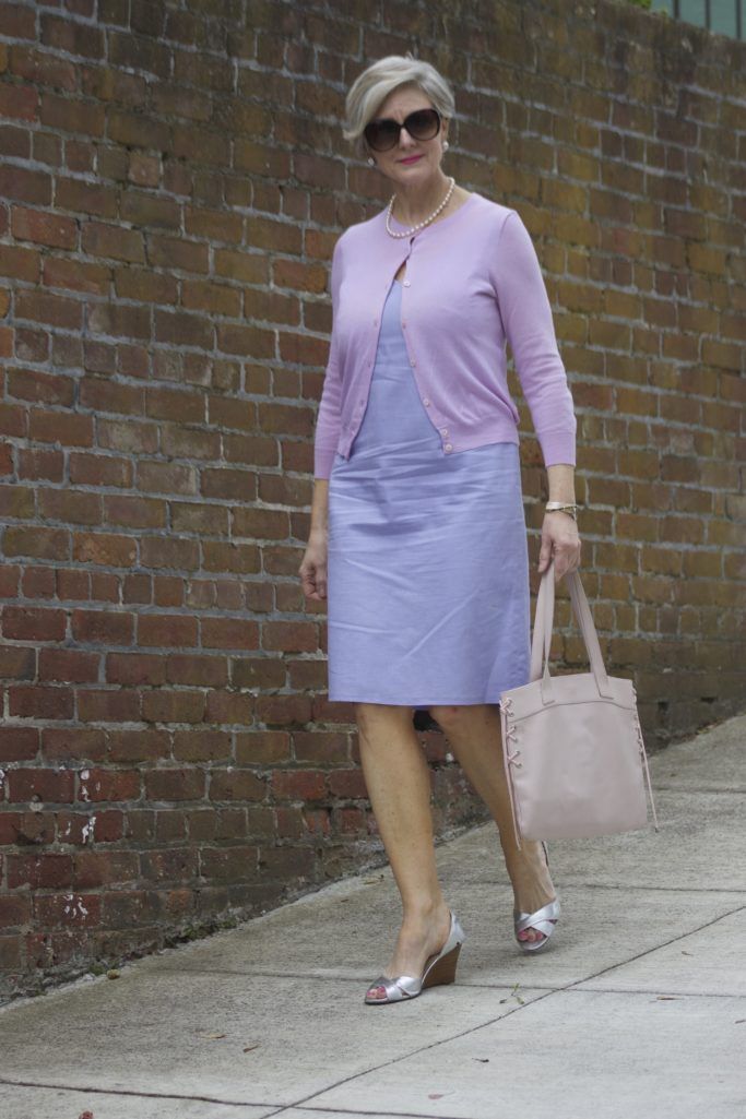
8. Lavender
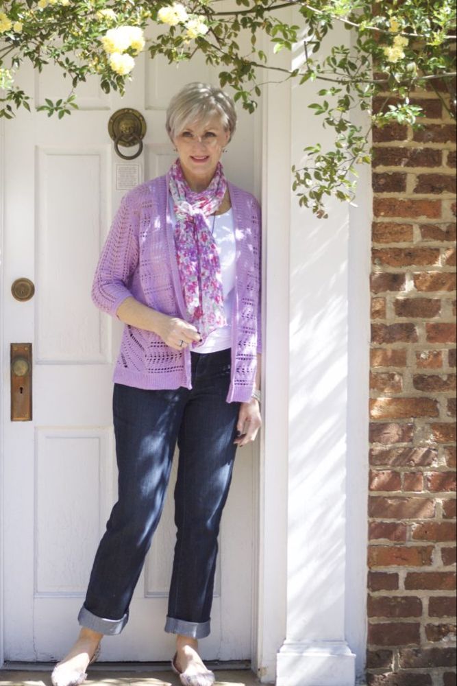
Why It Works After 60
Lavender has a soft and graceful quality that feels fresh. It adds gentle color to an outfit while still looking refined and sophisticated.
It can also brighten the complexion beautifully, especially when worn near the face in softer fabrics.
Best Pairings
- Lavender and soft gray
- Lavender and cream
- Lavender and navy
- Lavender and silver
Best For
Lavender looks good on women with gray or silver hair because the cool softness feels naturally elegant together. It flatters cool and neutral undertones particularly well.
What To Avoid
I would avoid pairing lavender with very bright purple tones because the contrast can feel too overpowering.
Overly shiny fabrics can also make the color appear less sophisticated.
How To Wear It
Wear lavender is through soft knitwear, scarves, or blouses paired with tailored neutrals. I also love lavender with silver jewelry because the combination feels polished and graceful.
9. Powder Blue
Why It Works After 60
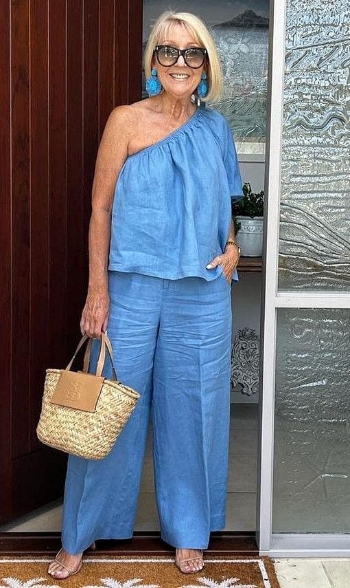
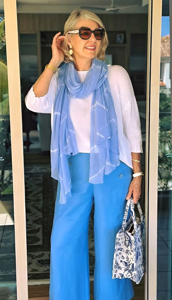
Powder blue has a calm and airy softness that looks incredibly elegant after 60. It brightens the face without feeling harsh or overly bold.
It also gives outfits a fresh and polished look while still feeling timeless and easy to wear.
Best Pairings
- Powder blue and soft white
- Powder blue and navy
- Powder blue and cream
- Powder blue and soft gray
Best For
Powder blue suits women with silver or blonde hair well because the soft tones create a fresh and harmonious effect. I also find that it works beautifully on cool and neutral undertones.
What To Avoid
I would avoid pairing powder blue with overly neon shades because the softness of the color can get lost. Very dark styling from head to toe can also make the outfit feel unbalanced.
How To Wear It
You can wear powder blue in lightweight tailoring, soft sweaters, or flowing blouses paired with pale neutrals.
It can also be styled with pearl accessories because the combination feels timeless and sophisticated.
10. Sage Green
Why It Works After 60
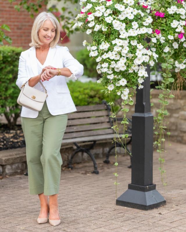
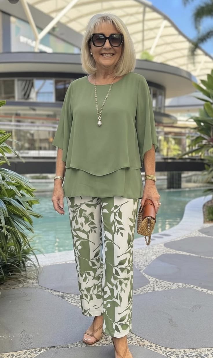
Sage green has a soft and calming elegance. I love how it adds color in a subtle way without looking too bold or trendy.
It also has an earthy sophistication that makes outfits feel relaxed, polished, and effortlessly stylish.
Best Pairings
- Sage green and cream
- Sage green and soft white
- Sage green and camel
- Sage green and taupe
Best For
Sage green looks especially beautiful on women with gray or brunette hair because the muted tone feels naturally balanced and refined.
I also find that it works particularly well on warm and neutral undertones.
What To Avoid
I would avoid pairing sage green with overly bright greens because the softness of the shade can get overwhelmed.
Very shiny fabrics can also make sage green lose its understated elegance.
How To Wear It
Wear sage green is through soft linen, knitwear, or tailored jackets paired with warm neutrals.
I also love sage green accessories with cream outfits because the combination feels timeless and sophisticated.
11. Light Camel

Why It Works After 60
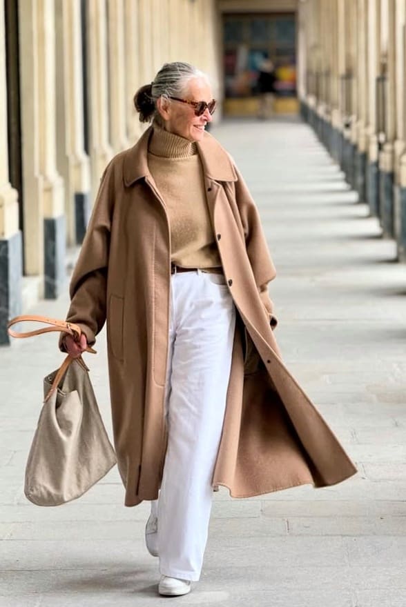
Monochrome outfits in these shades look extremely classy. Light camel has a warm and understated elegance that always looks polished after 60.
I love how it gives outfits a soft luxury feel without trying too hard.
It is also much gentler on mature skin than very dark browns or harsh beige tones, which makes it incredibly wearable.
Best Pairings
- Light camel and cream
- Light camel and soft white
- Light camel and sage green
- Light camel and navy
Best For
Light camel looks especially beautiful on women with blonde or brunette hair because the warmth of the shade feels rich and balanced.
I also find that it flatters warm and neutral undertones well.
What To Avoid
I would avoid pairing light camel with very icy tones because the contrast can make the outfit feel disconnected.
Overly dull or muddy browns can also take away from its refined look.
How To Wear It
You can go for light camel is in structured coats, knitwear, or tailored trousers layered with soft neutrals.
I also like light camel with gold jewelry because the combination feels timeless and expensive.
12. Dove Gray
The color to avoid is *drum beats* … Black. I have placed it at the end because here is a list of other colors to avoid for women over 60. Now u know what to go for, you should also know what to avoid.
Black is often seen as a timeless color, but it is not always the most flattering choice after 60.
A head-to-toe black outfit can sometimes make skin look dull and highlight shadows around the face.
Black can also look a little heavy and severe, especially during the daytime.
Black can still work beautifully when paired with colorful accessories or a lighter top near the face.
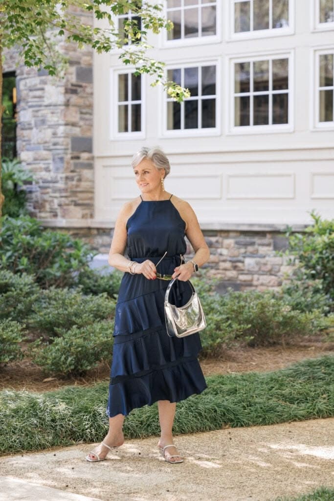
A great alternative is Dove Gray. It gives the fun of black without the drawback. It is a soft shade that tends to brighten the complexion and create a fresher look.
If you made it til here, consider sharing on Pinterest.
Share on Pinterest